

Social media is a great platform to build relationships between people and allows us to easily connect with others around the world. We can use it not only to promote the school, but to also extend the school community online and stay connected with former and current students. Anyone who sees something from a Facebook post, an Instagram photo, or a quote on Twitter should be able to get a taste for what the School of Ministry is all about.
Every campus will have its own style and story to tell. Following these simple instructions will keep our image united and consistent.


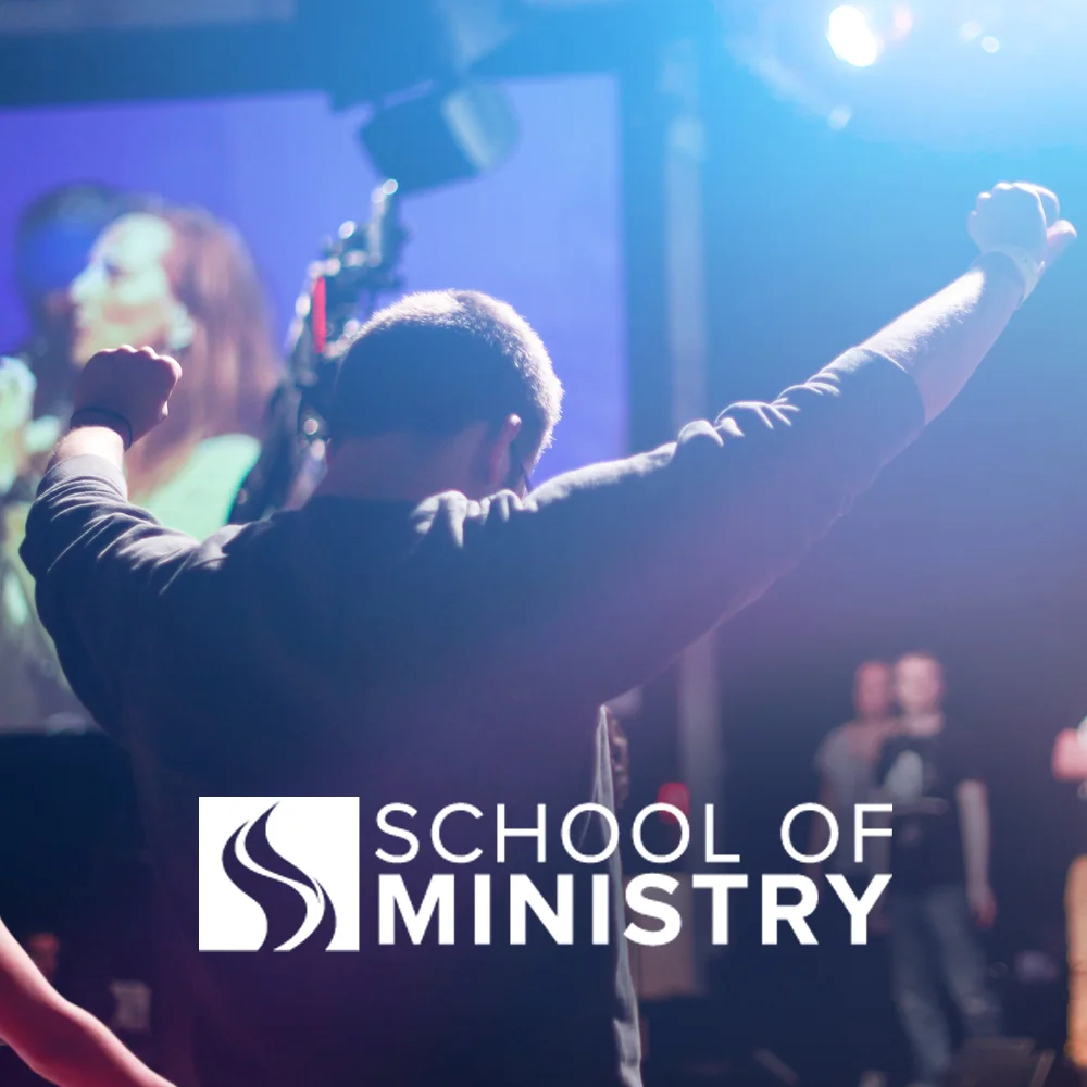
Icons
The School of Ministry Flame icon may be used on its own in a square avatar icon. This is the only case in which this can be done; when used elsewhere, such as in print material, the full logo must be used.

Layout
The correct placement of text on a photo is of extreme importance. It differentiates being unprofessional and sloppy from being intentional and powerful in communication. An image must always feel "clean," without unnecessary text or effects.
Always let the subject in the photo have hierarchy, giving it plenty of space from any text or logo.
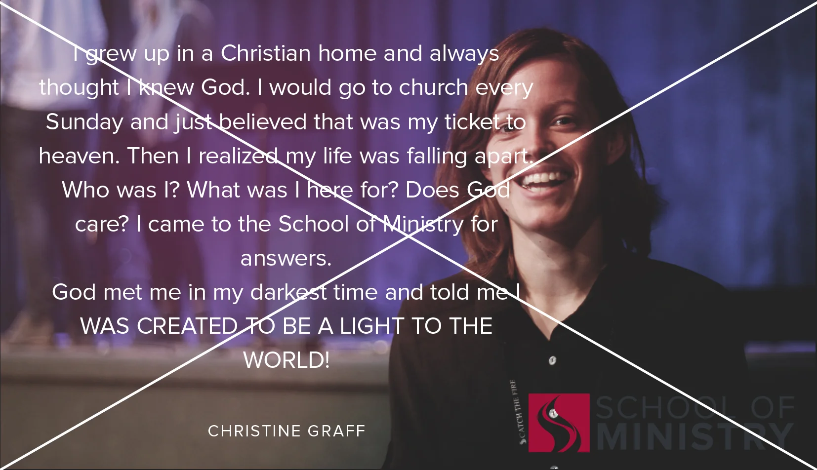
While in general we want as little text as possible on a photo, an exception is allowed if you are creating a testimony image. Because a testimony so clearly demonstrates the transformation that the School of Ministry aims for, it does not distract from the clarity of our message. This being said, use only an excerpt from the testimony, up to 140 characters in length. You may post a link to the full testimony along with the photo.
DO:

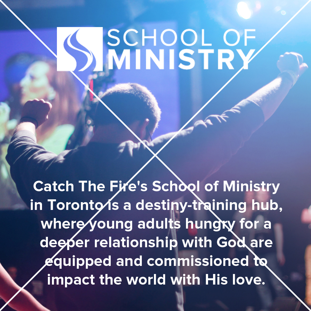
Proper lighting with subject matter that gives a good look at what goes on in the School of Ministry.
Good, simple, clean layout. The subject matter of the photo is clear and well-composed.
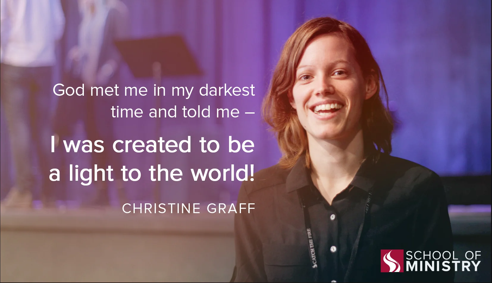
Short summary of testimony properly placed, with clear visual hierarchy. Bright, clear photo of student. Legible logo in corner.
Do not:
Unnecessary text is taking up too much of the photo. The subject matter in the photo loses its hierarchy.
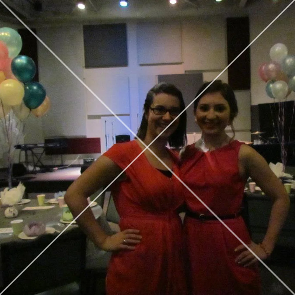
Photo is too dark and grainy. Composition is not very strong.
An entire testimony does not need to go on a photo, only a highlight is necessary. Make sure to keep the subject matter in clear view, without any text on top of faces. The logo is too dark for the background of the photo and is too large.