


An example of a "light leak," used overlaying a photograph to add colour.
Proper Use
Use photography to convey the heart and life of the School of Ministry. Transformation, vibrancy, boldness, and people-centric are a few words to keep in mind concerning photography relating to our brand. Put a high priority in proper lighting and pleasing colours.
Because our mission is about transforming lives, our photos must be able to convey how lives are being impacted. For instance, in the photo to the left, the students are attentive and engaged in the moment. For a music-centric photo, there must be a personal connection shown; whether it be corporate worship, fellowship, or simply personal devotion.
To add vibrancy, on occasion we use "light leaks" on our photos; this adds a splash of color to our subject matter. To do this, on Photoshop you have your light leak as a layer on Screen at about 30% opacity over your photo. We have provided a few of the files we use for light leaks within the photo resources download.
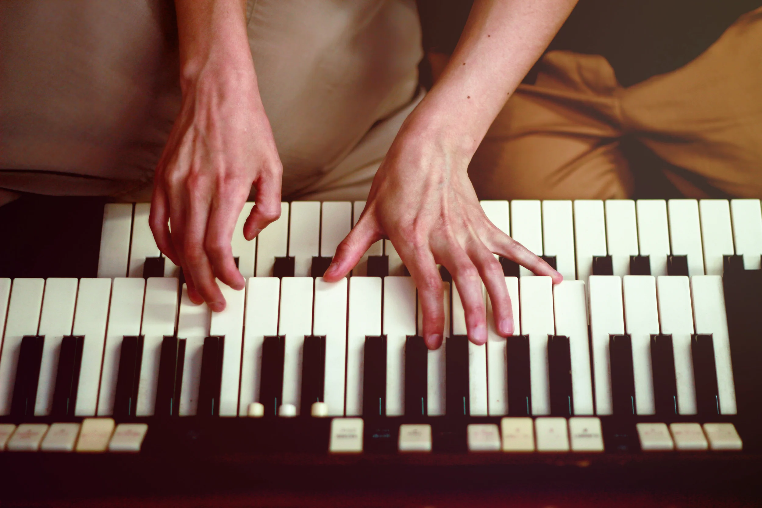
This photo properly balances light and contrast, giving a warm and interesting impression.
Improper use
Stay away from dark, grainy, or "moody" photography. This can often be fixed with simple photo editing, by adding brightness and/or contrast to the photo. Similarly, do not over-saturate the photo or lessen the authentic image we want. Most photographs are to maintain natural coloring with minimal effects.
To the left is a properly edited photo, with two improperly edited photos beneath. We have provided explanations for why or why not they fit within School of Ministry branding.
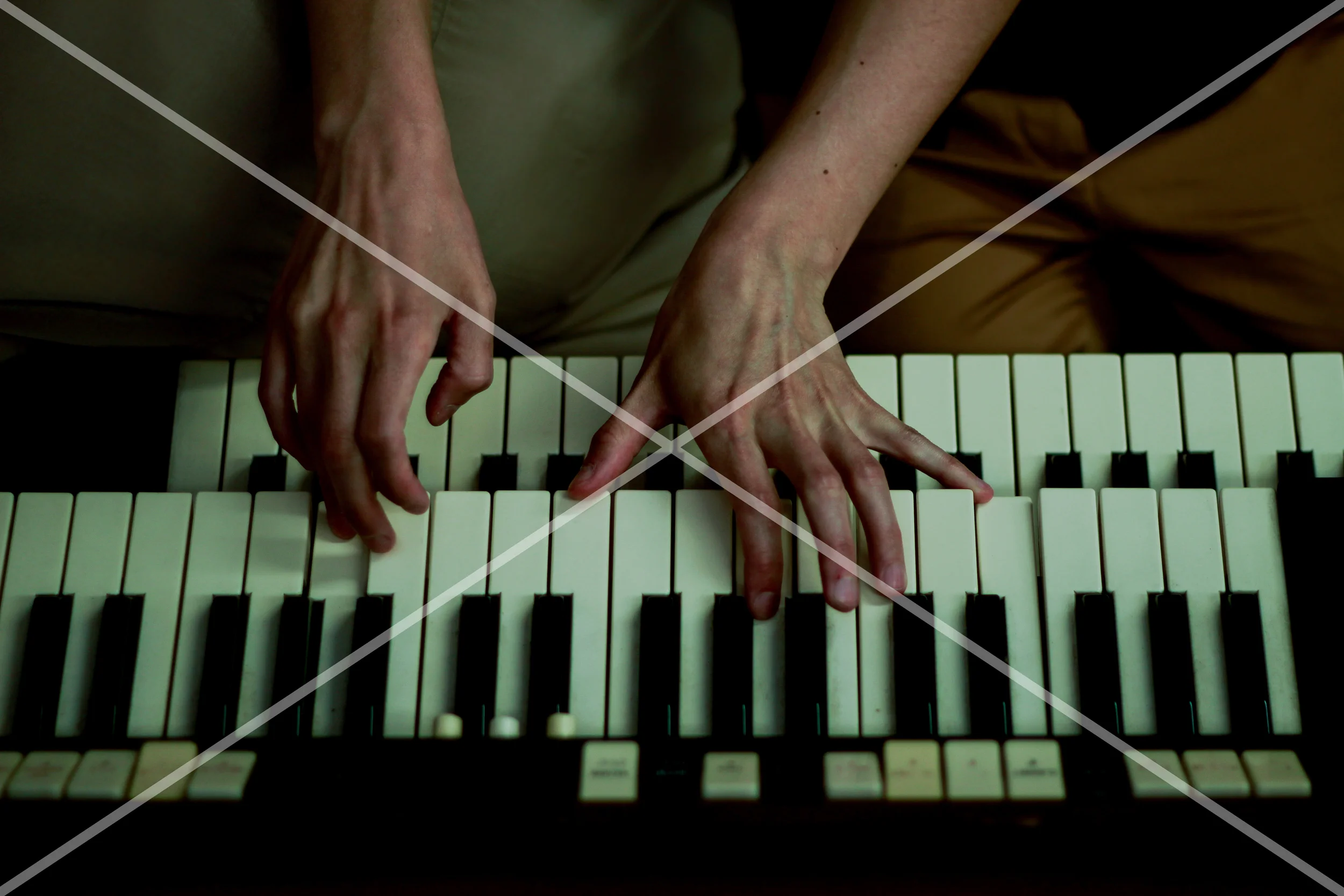
This photo is too dark and feels gloomy. A proper photo should feel light and vibrant.

This photo is too saturated and looks unnatural. Generally a photo should have more natural coloring than effected coloring.
Examples of Photography
These photos were taken by School of Ministry students in Toronto. Feel free to use them for your own School of Ministry! Also use them as a guide for how to take your own photos. We encourage you to capture the personality of your school by taking photos that represent your unique atmosphere.